A paydown chart is a visualization of the flow of funds from the collateral pool to the different tranches in a securitization.
If you’re not familiar with securitizations, here’s how the financial engineering works:
A bank combines a pool of loans made to individual borrowers to create an investable bond. The loan pool serves as collateral for the security, while the liability is divided into portions, or tranches, which form the bonds that investors can buy. Tranches vary in credit risk and are designed to fit the needs of the investors.
A securitization is governed by a set of rules that determine how money flows from the collateral pool, as borrowers repay their loans, to the tranches i.e. investors. There’s a hierarchy in which different tranches recieve principal and interest payments from the collateral pool. The more highly rated a tranche, the earlier its claim on these principal and interest payments. Lower rated tranches are far more likely to lose money if too many borrowers default on their loans.
Paydown charts can either show historical payment data or projections given a set of assumptions. The latter is usually what investors care about.
Predictive paydowns are trying to answer question like this: if the prepayment rate for this securitization is 10% and the total defaults sum to $1,000,000 then will all the tranches in this securitization be fully repaid? If not, how much money is each tranche likely to lose. When will Tranche B (say, the second in the hierarchy of tranches) start receiving principal payments?
The Evolution of the Paydown Visualization
Here’s one of the earliest attempts at visualizing the paydown of a security, from MATLAB, still in use today:
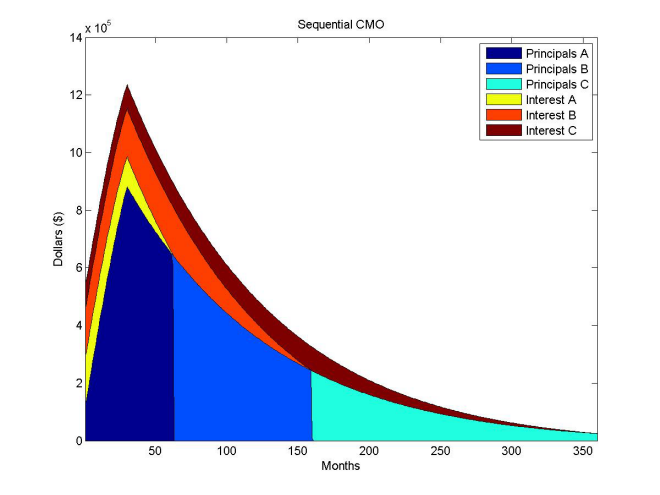
At first, I was thrown off by the blue-toned blocks that end so abruptly, annotated as Principals A, B & C in the legend. But when you think about how principal is repaid in a securitization it starts to make sense. First Tranche A gets paid its principal in full, then B and then C. Interest payments follow similar patterns — the yellow slice that represents “Interest A” gets fully repaid at the same time principal payments terminate for Tranche A, and so on.
This chart is a visualization of the dollar amounts of principal and interest that are being paid out to the different tranches over time.
This is not a very good visulization — it is frustratingly difficult to eyeball the vertical separation between the diagonal lines that form the different types of payments to properly gauge the proportion of principal to interest.
This is how our eyes are likely going to read the gap between the two lines that form the boundary of an interest payment:
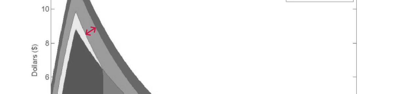
But does dollar amount really matter? Counterintuitive as it may seem, in this wonky corner of structured finance, no. Any trader worth his salt looking at such a visualization would already know what the bond coupon is and that it’s not going to change.
What matters more is what will happen (Will all the interest expected in pay period actually get paid? Will there be a principal writedown?) and when it will happen (Is the weighted average life of the paydown of this tranche significantly earlier or later than expected?).
Which brings us to Bloomberg’s paydown visualization, or the first real leap in data viz design thought in this chart.
Here’s a screenshot of a paydown chart on the Bloomberg Terminal that I found on Bloomberg L.P.’s PR site:
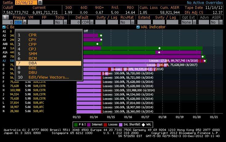
Instead of focusing on the dollar amounts of the payments, this viz focuses on payment events and when they happen. HUGE.
In addition to showing principal and interest payments, which is all that’s shown in the MATLAB chart, this one also shows losses, interest shortfalls and the weighted average life of the paydown in each tranche.
It’s also waaay easier to read when you’re dealing with a security that has a more complex tranche structure.
BUT. It looks like a stacked bar chart, a classic quantity comparison viz. Albeit, a very strange stacked bar with multiple stacks of the same color. Confusingly, the paydown chart above is a timeline visualization masquerading as a bar chart.
Here’s how this chart works:
Each tiny slice of the bar represents a single period of time during which one of four things happened, as per the legend:
- a principal + interest payment was received (P&I)
- an interest payment received (Interest)
- there was an interest shortfall (Int. Shortfall)
- there was a loss (Losses)
There’s also a little diamond shaped mark to denote the “WAL” or the Weighted Average Life of that tranche.
But there are two ways in which this chart fails:
- It took me a awfully long time to stop reading this a quantity comparision. It looks to much like a stacked bar chart.
- It fails to represent each time period as a discrete object.
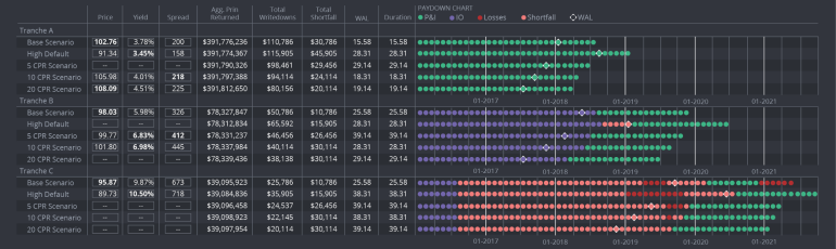
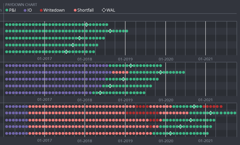
dv01’s New! Improved! Paydown Viz
The biggest leap in designing our version of a paydown visulization was recognizing that discrete periods matter. Instead of smushing all the periods into a bar, each payment period is represented by a small circle. In the consumer loan market this is one month.
This makes paydowns easier to read — it’s much easier to count circles than to extrapolate the passage of time from relative length.
Ta-da! This version is pretty close to the version that’s going live on our app soon:
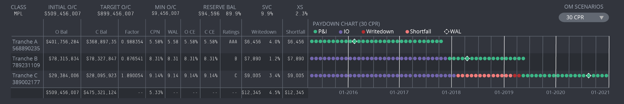
Instead of having the paydown viz as a standalone representation of data, we decided to treat it a bit like a sparkline — a visualization that lives as part of a table. You get an overview of the numerical aspects of each tranche AND a projection of how the payments will go down.
Design bonus: not having to label each tranche twice saved us some jealously rationed horizontal screen space.
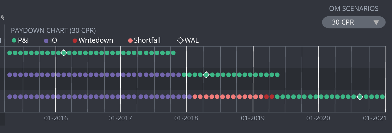
Close-up of just the paydown bit:
Here’s another version of this paydown viz in our yet-to-be-released cashflow engine. This one allows users to run multiple cashflow scenarios and make comparisons.
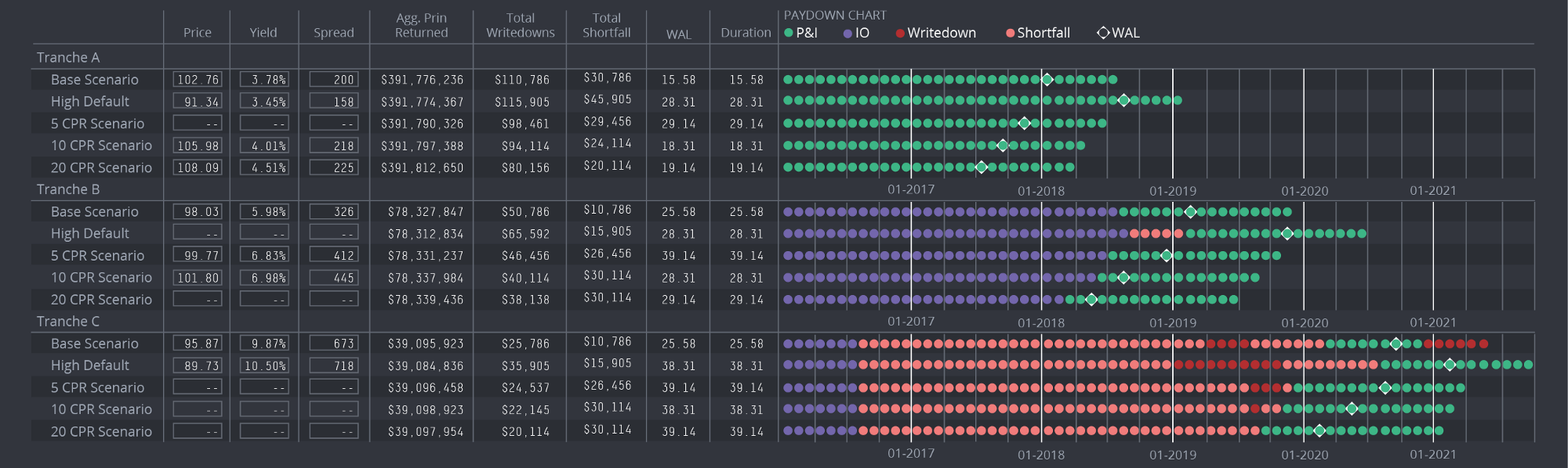
Closeup:
Why are wonky finance visualizations so hard to read, anyway?
I have a hypothesis. There’s a very high return-on-investment on being able to process wonky financial information. People who work in finance are uniquely motivated to learn how to do complicated finance things fast. Even if a chart or data table is difficult to parse, if you work in finance you’re likely to push past its terribleness and figure it out.
It’s easy to get lazy with design when you have such a motivated set of users.
