When I joined Uber in 2019, the Base Web design system, only about a year old at the time, had a solitary table component that was one of the worst tables I’d ever seen in my life. It was a fairly simple grid with neither row nor column delineation, and had no functionality past the ability to display data in a columnar grid that lived in a window with scroll enabled. I wish I could show y’all, but Uber’s design system has since sunset that specific component.
I’d been hired to work on Uber’s Core Data Platform tools, and within my first few months I saw at least 7 different data tables, none using the aforementioned useless table component from the design system. They were all kinda okayish, designed by engineers, and custom built to support the specific usecase of the tool it lived in.
I was so irritated by this stupid, useless table component I wrote up a manifesto on why it sucked and sent it to Jeff Jura, Uber’s head of Design Systems at the time. He asked if I’d like to redesign the table, and offered the time of a single design engineer on the Design System engineering team.
Every single SaaS tool is table under the hood. It usually contains a variety of visualizations of business data that allow users to reason about what needs to be done, and then more UIs to actually do the work. Deconstructed, the “do the work” part can more often than not be distilled into doing something to whatever is connected to one or more rows in the underlying dataset that fit some sort of criteria.
And that is what I optimized Uber’s Base Web Rich Data Table component to do:
- Display data in an easy to read manner: Data type based styling
- Allow users to define criteria to slice and dice the data: Search and filtering UI
- Allow users to then do something to selected or filtered data: Bulk select and actions
It’s been 5 years since we shipped this component, and I’d been wondering how much use it actually sees. I recently reached out to Chase Starr, the engineer I worked with to build this in 2019 to ask. His response:
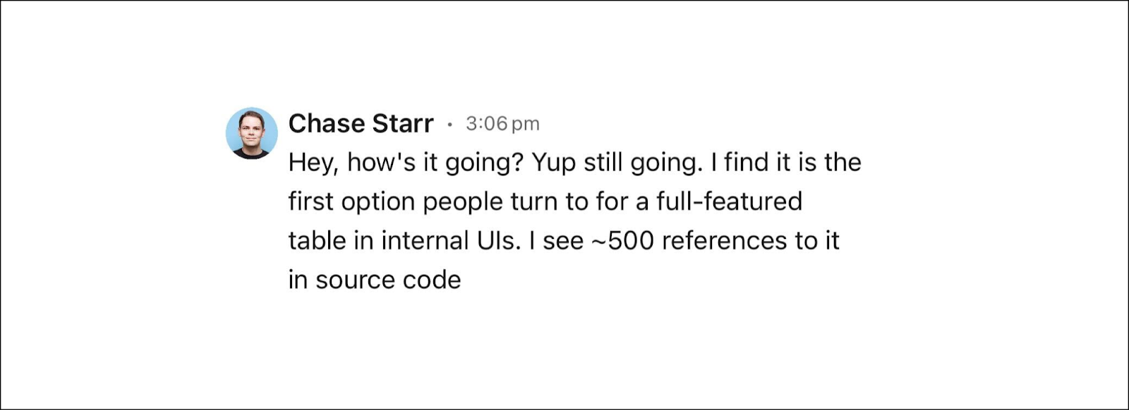
500!!!
That’s way more than I expected. Assuming it would take approx 2 weeks of effort for an engineer to build some relevant subset of the functionality of the component – that’s 1000 eng weeks! Priced at about $300k/48 weeks, that’s ~$6 million of saved engineering time.
Now admittedly, this is the sort of napkin math that is only really good for telling stories. No doubt someone else would have eventually built a table component after some 100 odd instances of shitty custom built tables? One would hope? Anyway, $6 million is a nice number and I’m sticking with it. Not bad at all for about 2 weeks of design work and 2 months of eng time!
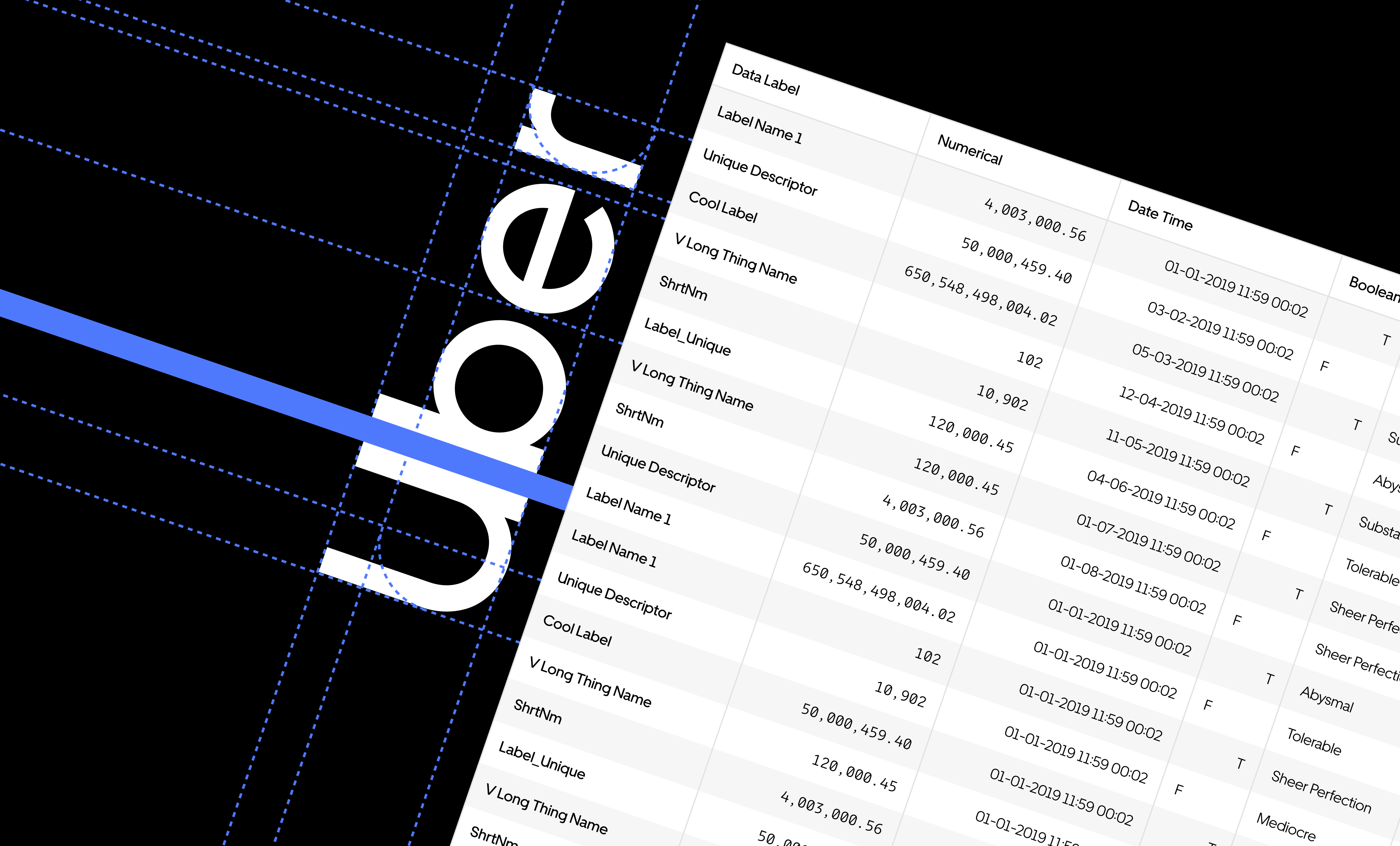
A few glamor shots of the table… (Or you can look at more detail in this Figma)
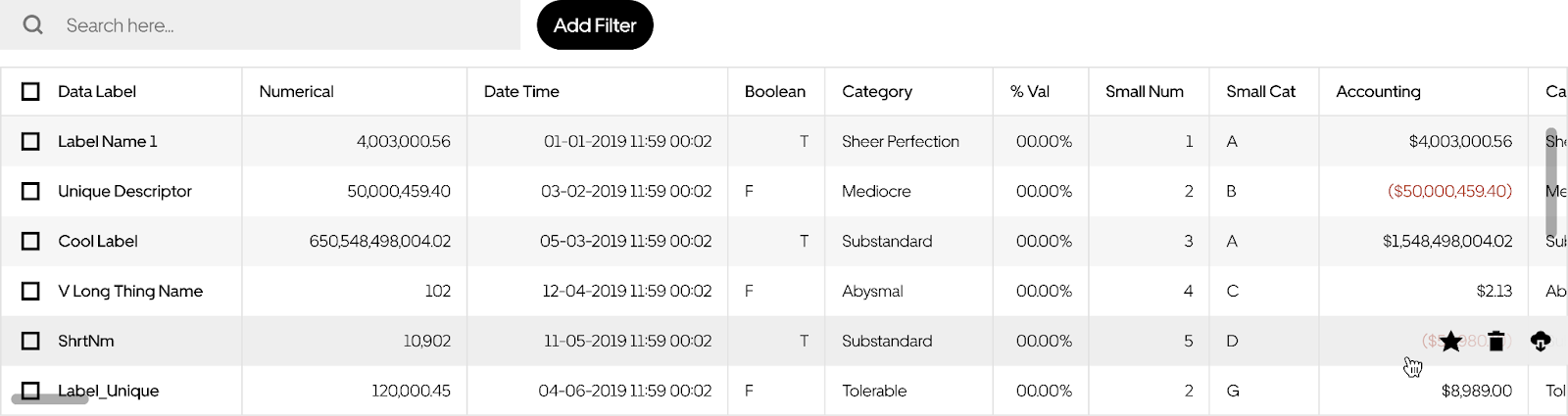
Data type based styling
I designed this component to support slightly different styles for Label-Text, Text, Categorical, Numerical, Accounting, Date-Time and Boolean data. A dev implementing this component can also choose to custom style a column any way they like. This table is sortable, searchable and filterable.

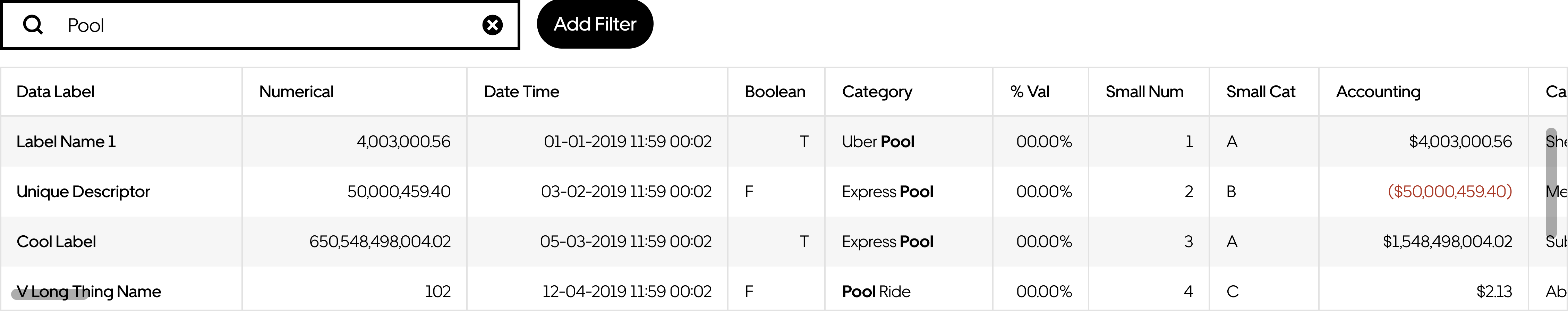
Search & filters
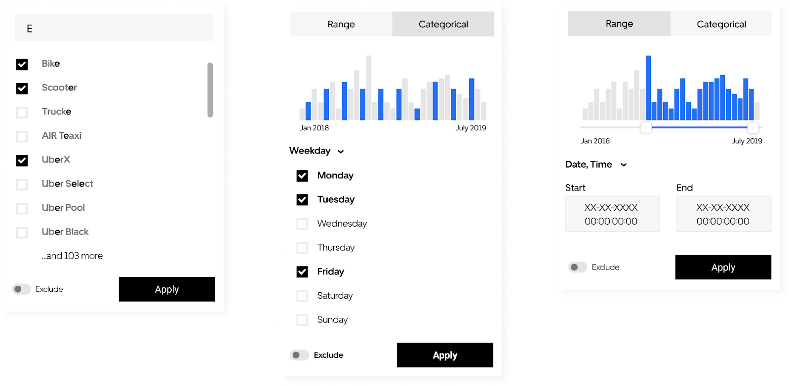
This component comes with free text search as well as a filtering UI that allows users to define criteria by column and string together criteria across columns using a default “AND” separator. Unfortunately, filtering is not supported on text and custom styled columns.
A few mocks of filtering component itself, though the time series ones never got shipped:
Applied filters:

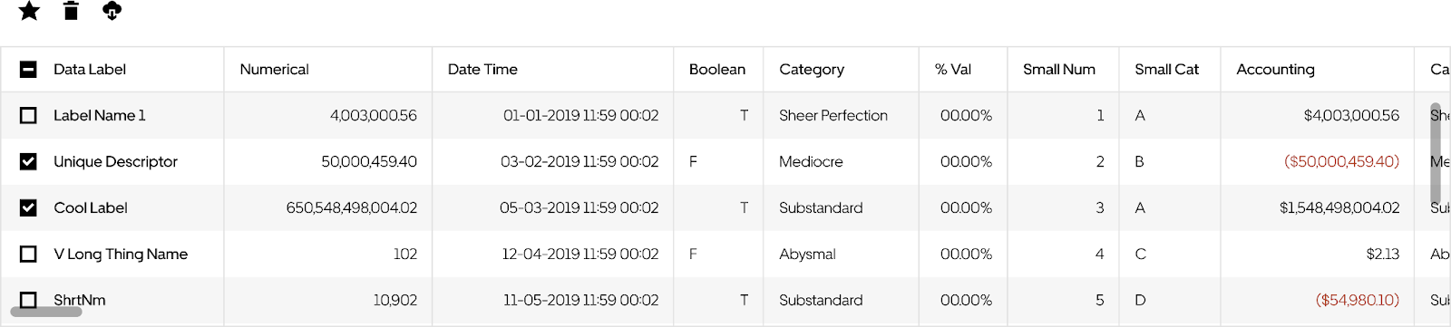
Bulk select and actions
This table can be implemented to support a checkbox select index on which you can configure any number of text or icon buttons. All actions can be seen when a user hovers over a single row, or above the table if one or more rows is selected via the checkbox UI.
The row hover:
Bulk select mode:
Base Web is an open source design system, if you found this component useful and decide to deploy it in your own app, I would LOVE to hear about it! Email me!
